Tuesday, March 31, 2009

{ the workshop in march }


This stamp set is Sip by Sip. I love it....it's probably my favorite! I am a coffee lover! And if you haven't heard, I gave up my Starbucks for Lent. Now, this may not be a big deal for most people, but I was having Starbucks everyday. It is like an addiction (I assume)! Well, I am proud to announce that I have been Starbucks sober for five whole weeks! Go me! But I digress...our monthly workshops are held in the loft above Beans 'n Cream in Columbus. Shout out! In the spirit of environment, I thought a coffee card would be appropriate. The quote on the card reads, "Enjoy life sip by sip, not gulp by gulp." I thought that was pretty profound. The colors are from the Earth Elements family (and one of the In Colors) - Kiwi Kiss, Chocolate Chip, Pumpkin Pie, Summer Sun, and Whisper White.




{ the workshop in february }


I have a monthly workshop with a group of creative ladies in Columbus. Every month, we make two projects. This card was one of the projects. I like to call it "Sweet Flowerpots." Stupid...I know! The stamp set it Sweet Stems. I used Certainly Celery and Barely Banana cardstock. The pots are made using the round tab punch on Really Rust cardstock. This is a cute spring-like card. I think the ladies like it! The other project was the candy box. I posted those a while back!

{ the baby album }


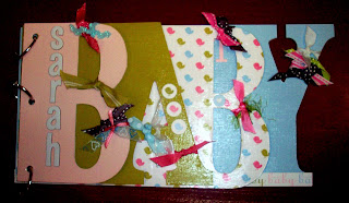
A friend of mine had a beautiful baby girl back (named Sarah) in December. I made this word album for little Sarah. You can get these at your local Hobby Lobby; they have FAMILY, FRIENDS, BABY, and LOVE. They are fun to do....a little time consuming.....but fun! The paper is Stampin' Up!'s Rock-a-Bye Girl Simply Scrappin' Kit. It came with stickers and embellishments! So awesome! I put a layer of Mod Podge on all of the pages. And by the way, Mod Podge is my new favorite accessory. I have done a dozen of these word albums before. This was the first time I used the Mod Podge on one. Love it!!!!!! Jamie really liked and appreciated the album! I cant wait to see it once pictures are put in it.

{ the birthday }


Today is my very good friend's birthday! So, of course, I made her a card. This was her birthday card. I found this layout on a website I frequent. It is soooooooooooo simple to do! The only thing that is stamped is the bow at the top. I used one of my favorite stamp sets...Pick-a-Petal. Just to jazz the card up a bit, I added a little irredescent glitter glue. I just love glitter glue! It adds a POP to a card! I think I am joining Glitter Glue's Fan Club!

{ the wedding favors }


Victoria wanted wedding favors also! These are what I like to call "Sour Cream Pouches." These are fun because you can make them for any occasion. The ones for the wedding had chocolates with a "D" on them (Victoria made those.) and Jordan Almonds. All of the papers are Stampin' Up! I printed a script D on So Saffron cardstock, then punched them out and put them on scallop-punched cardstock...all tied together with Old Olive grosgrain ribbon!

Sunday, March 8, 2009

{ the wedding book }

As if you didn't already read the title of this post, these are the pens and guestbook I did for my friend's wedding. The idea was "stolen" from a local gift shop. And I like a challenge, so when Victoria asked me if I could make one for her, I accepted. I was incredibly proud of these. She wanted a guestbook where not only could the attendees sign, but they could write a message. I had a pretty good message, if I do say so myself....and I do! My message is the one in the picture. It says, "There is only one happiness in life, to love and to be loved. Congratulations to you both! Love, Jennifer." The pens are super cool! It is just a Bic pen that is wrapped with ribbon. Then at the top of the pen is a rose (made out of ribbon). I love how this looks.
Posted by Picasa

Sunday, March 1, 2009

{ the ribbon }

Now, the stamp is not Stampin' Up! But the card stock, ribbon, and ink colors are. I love the softness of these cards. And I love how the ribbon color changes the look of the card, yet they are equally appealing.

I can't choose the one I like best.
Posted by Picasa

{ the butterfly pop-up }

This was a card I did for a make-and-take at the January workshop I had in Columbus. It is a bit time-consuming, but the outcome is beautiful.
On the front of the card, I used Designer Series Paper in Kiwi Kiss, Baja Breeze, and Chocolate Chip...three of my favorite colors that I ALWAYS use. And when you open the card, the butterflies look to be in flight. I love the stamp set (Flight of the Butterfly) because you can mix and match the design of the butterflies. The spiral part is just a circle that I cut.
On the difficulty scale, I give this card a 2.3 out of 5. It is rather simple to do, just tedious. You have to cut out all of the butterflies...ugh! But once it is finished, you are like....OOOOHHH!!!! AHHHH!
Posted by Picasa